Color Theory for Paint by Numbers: Why Some Palettes Sing and Others Go Muddy
Learn colour theory for paint-by-numbers: why value matters, how warm and cool colours create depth, and how to keep your paint mixes from turning muddy.
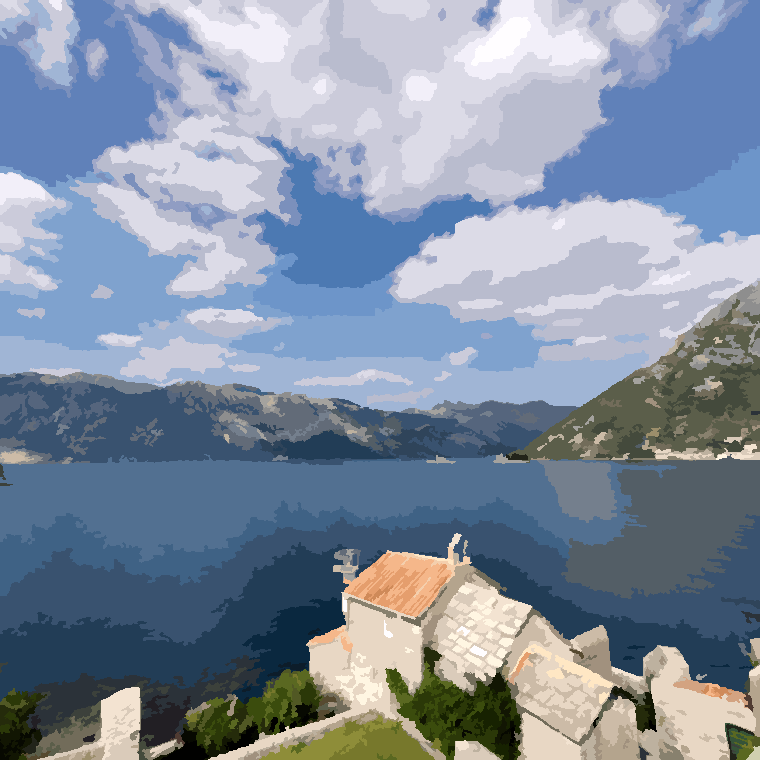
You don’t need colour theory to paint by numbers. That’s rather the point — the palette is already chosen, every zone knows which paint belongs in it, and you can finish a picture without once thinking about a colour wheel.
It earns its keep later. When a palette looked odd on screen and then somehow works on the canvas. When you’re mixing real paint and a clean set of colours keeps sliding towards grey-brown sludge. What follows is the part of colour theory that helps with those, and none of the seminar.
Value does more work than hue
Value is how light or dark a colour is, independent of what colour it is. A lemon yellow and a navy blue are wildly different hues; what tells your eye it’s looking at a face is the difference in value between them. Hue is the adjective, value is the drawing.
The test for it costs nothing. Squint at your photo until the detail blurs out — what survives is value. If you can still tell where the person ends and the background begins, the photo has the structure to convert well. If it flattens into one grey mush, no amount of colour will rescue it. When a finished painting disappoints, this is usually the reason.
There’s some engineering behind that, as it happens. When Wabihana fits a palette to your photo it works in a perceptual colour space, where lightness sits on its own axis and the gap between two colours roughly matches how different they look to a human eye rather than how far apart their raw red-green-blue numbers are. So the palette spends its colours where you’ll notice them, and two blues you couldn’t tell apart get merged rather than eating two numbers.
Warm, cool, and why a palette needs both
Then there’s temperature. Reds, oranges and yellows read as warm; blues, most greens and violets read as cool. Warm colours appear to come forward and cool ones to recede, which is why a portrait with a warm face against a cool background has depth, and one where everything shares a temperature looks like a sticker.
You’ll notice this in your own palette key. A photo taken at golden hour gives you a mostly warm set with a few cool shadows; an overcast beach gives you the reverse. The handful of colours running against the grain are doing the heavy lifting. They tend to be the shadows, and the temptation when painting is to treat them as “the grey one” and rush them. Don’t — those are the numbers that make the picture sit in real light.
Why colours turn to mud
Mud is the commonest complaint from anyone mixing real paint, and it has one main cause: mixing complements. Colours opposite each other on the wheel — red and green, blue and orange, yellow and violet — cancel each other out. A little of one into the other knocks the intensity down, which is often exactly what you want. Too much and you land on a dull brown-grey, with no way back except starting the mix again.
Almost nobody does this deliberately. A dirty brush carries a trace of the last colour into the next. A crowded palette lets two puddles creep together. Three or four paints get stirred in to get it closer, and each one drags the mix further towards neutral. More often than not, mud is a housekeeping failure.
- Rinse and dry the brush between colours, not between zones
- Mix from two paints where you can, three at the outside
- Adjust value first with white or a dark, then nudge the hue
- Mix the whole batch for a number in one go, so it stays consistent
- Adding a fourth and fifth paint to “correct” a mix
- Reaching for black to darken — it deadens the colour
- Letting complements bleed together on a crowded palette
- Judging a mix while it’s wet — acrylics dry noticeably darker
A small palette is easier to make look good
Restriction helps here, which is not obvious until you’ve seen it. When every colour in a picture is mixed from the same few paints they share a common thread, and the thing hangs together almost by itself. Painters have chosen limited palettes deliberately for centuries. It’s also why a Sketchy canvas at 16 colours doesn’t look like a failed attempt at a detailed one — it looks like a poster, and posters are a style.
What more colours buy you is fidelity. Harmony you get either way, which is worth remembering when you’re choosing between the detail levels. For that trade-off in full, there’s how color count changes difficulty.
Read your palette key before you paint
Thirty seconds with the palette before your first fill makes the whole session smoother. Worth finding:
- The darkest and the lightest. Those two anchor everything else. Paint the darkest number early and you’ll have a reference to judge later mixes against, instead of guessing somewhere in the middle of the range.
- The near-twins. Most palettes hold two or three colours that look almost identical in the key. That’s a gradient, usually across a sky or a cheek. Keep them straight and the transition comes out smooth; swap them and it bands.
- The odd one out. There’s often a single colour that looks wrong on its own — a sour green, an unlikely lilac. It nearly always turns out to be a reflected light or a shadow, covering maybe four zones, and doing more for the picture than its size suggests.
If you’re painting on paper rather than a screen, the printable blank canvas includes the key as its own page, and can print a mixing guide alongside it — a recipe in whole percentages for each number, worked out from how pigments actually behave when they’re mixed rather than how screen colours average.
What a palette can’t fix
Sometimes a palette just doesn’t sit right, and it helps to know where the limit actually is. The palette is fitted to your photo, so it can only describe colour that’s in the file to begin with. A dim, low-contrast or heavily filtered source gives you a set of similar mid-tones. The palette didn’t choose badly; that’s what was there.
That’s a photo problem, and it’s fixed at the front of the process rather than the back — which is what choosing the perfect photo is about, and why the palette comes out the way it does is covered in how a photo becomes a numbered canvas.
If you remember one thing
Make it value. Get the lights and darks right and a picture reads even when the colours are strange; get them wrong and no palette will rescue it. Temperature, complements, keeping a mix clean — all of that is refinement sitting on top, and most of it you pick up by looking at the key before you start rather than after something has already gone grey. Start with a photo and give the palette a proper look before your first fill.
Frequently asked questions
Turn your own photo into a paint-by-numbers
Free to start, private, and ad-free while you paint — on web, iPhone, and Android.
Start painting